Painted Crafts
Gzhel: one cobalt, a dozen blues
The whole style is a single pigment handled like watercolor: cobalt on white, fired hard, and recognizable by a brushstroke no two of which match.
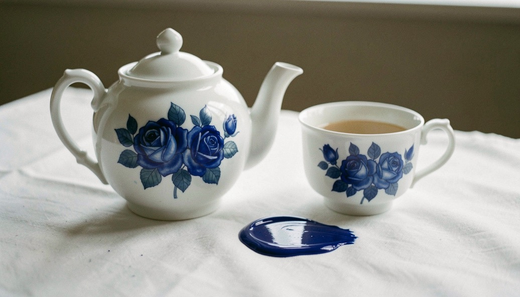
Gzhel is a place before it is a style: a district of clay villages some sixty kilometers southeast of Moscow, documented as a source of pottery since the fourteenth century, when a charter of Ivan Kalita already names it. Out of those pits came coarse pots, then majolica, then the white and blue wares the name means to the world today. The modern canon is narrow and demanding, one cobalt on white porcelain, and that narrowness is what makes it so checkable.
From clay pits to porcelain
The district’s history is a ladder of technologies. Potters worked the local clays for the towns around Moscow from medieval times; the eighteenth century brought majolica with its painted tin glaze; the nineteenth century raised the game through semi faience and then hard porcelain, with the Kuznetsov combine, the largest ceramic enterprise of the empire, drawing on Gzhel kilns. Through all of it, blue painted decoration on a white or pale ground kept returning, a taste the region never lost.
The canonical style we now call Gzhel was consolidated in the twentieth century, when artists and art historians studying the old wares rebuilt a unified manner around cobalt brush painting on white porcelain, work associated above all with the painter Natalia Bessarabova in the 1940s and 1950s. The resulting vocabulary, roses, birds, landscapes in a single pigment, became the face of the craft worldwide.
The brushstroke that defines the style
The heart of the technique is a stroke with a gradient. The painter loads a brush so that one edge carries dense cobalt and the other a washed tone, and a single pull of the wrist lays a petal that shades from deep blue to near white, the color thinning as the brush empties. Flowers are built from such strokes, borders from such petals, and no two strokes on an honest piece are identical, because the hand reloads the brush and the kiln has the final word.
Firing completes the chemistry. Cobalt oxide is nearly black before firing and turns to its clear blue in the kiln, sealed under or into the glaze at high temperature; the depth of the blue is the kiln’s signature, and slight variations of tone across a set are normal and desirable. The white ground matters too: porcelain body, hard and ringing, not the chalky feel of painted plaster souvenirs.
Painted or printed: the practical differences
Because the style is famous, it is printed. Transfer decorations imitating Gzhel roses are common, and they fail on three counts that a minute of attention will find. First, the gradient: printed petals flatten to a uniform tone or show banded color steps, while a brushstroke shades continuously. Second, repetition: on a printed service, every rose is the same rose, rotated but identical, where a painter’s roses differ line by line. Third, the loupe: print is a lattice of dots, brushwork is a continuous field with bristle marks at the edges.
Base marks help but do not replace the eye: workshops sign and stamp their pieces, and an unfamiliar paper sticker on a soft white body deserves the same suspicion as any other craft. Indicative prices follow the work: printed small items sit near souvenir money, hand painted cups and teapots run higher, and large author pieces carry studio pricing.
| Signal | Hand painted Gzhel | Printed imitation |
|---|---|---|
| Petal tone | Continuous gradient within one stroke | Flat tone or visible banded steps |
| Repetition | Every rose differs in detail | Identical motif rotated across the set |
| Under a loupe | Continuous pigment, bristle edges | Regular dot lattice of the printing press |
| Body | Hard porcelain, clear ring, glazed foot | Soft, chalky, sometimes plaster like |
| Base | Workshop signature or stamp | Anonymous, or a glossy paper sticker |
| Indicative price | Mid range for cups and teapots, studio prices for author work | Souvenir band regardless of the label |
Living with cobalt and white
Gzhel is made to be used, and the glaze shrugs off daily washing; the enemies are the dishwasher’s heat and detergent, the microwave for any gilded detail, and the sun, which fades nothing in the cobalt but ages gilding and unglazed rims. Hand washing and display out of direct light keep a service honest for generations, which suits a craft whose whole charm is permanence.
A collector’s checklist
- Look for the gradient stroke: one petal, many blues, is the technique’s fingerprint.
- Compare roses across a service; sameness is the printer’s confession.
- Loupe one flower; dots mean print, bristle edges mean hand.
- Ring the body and read the base: porcelain and a stamp, or chalk and a sticker.
Common mistakes
- Buying the word Gzhel instead of the brushwork, which any transfer can borrow.
- Calling every blue and white cup Gzhel, when other European wares share the palette and not the stroke.
- Paying studio prices for printed services, whose dot lattice is visible for free.
- Assuming a sticker authenticates, when the kiln and the hand have already signed the piece.
The bottom line: Gzhel is one of the easiest crafts to verify and one of the most often faked, because the test is visual and takes a minute. Gradient, variation, continuous pigment: three checks that separate a painter’s rose from a printer’s, every time.